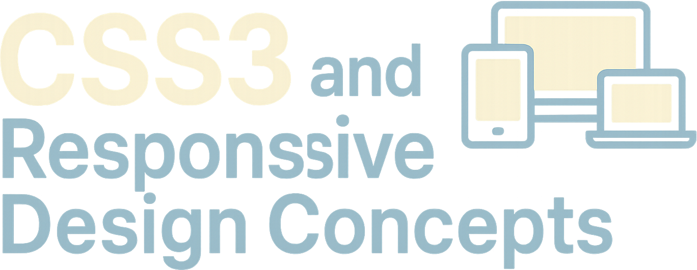
CSS3 and Responsive Design Concepts
Build modern, flexible web layouts that work across phones, tablets, laptops, and desktops.
CSS3 and Responsive Design Concepts is a practical Web Development course that teaches you how to style modern websites with clean, maintainable CSS. You will learn how to build modern, flexible web layouts that work across phones, tablets, laptops, and desktops while improving readability, accessibility, and user experience.
Build Responsive Web Development Layouts With CSS3
- Learn the CSS3 foundations behind selectors, declarations, the cascade, specificity, and inheritance.
- Build modern, flexible web layouts that work across phones, tablets, laptops, and desktops.
- Use Flexbox, CSS Grid, media queries, responsive images, and scalable spacing in real interfaces.
- Create polished, accessible, and maintainable styles for professional Web Development projects.
This course covers CSS3 and Responsive Design Concepts for building adaptable, modern web pages.
You will begin with the core principles of CSS3, including how styles shape modern web pages, how selectors and declarations work, and how the cascade determines which styles appear on screen. From there, you will learn how to manage specificity, inheritance, and style conflicts so your CSS remains predictable as projects grow.
The course then moves into layout fundamentals, including the box model, spacing, borders, sizing, display modes, document flow, and positioning. These lessons give you the practical foundation needed to create page structures that are stable, readable, and easy to adjust across different screen sizes.
You will also explore visual styling techniques such as color, backgrounds, shadows, typography, and CSS custom properties. These skills help you create consistent interfaces, reusable design values, and more polished Web Development projects without making your CSS harder to maintain.
Modern layout systems are a major focus of the course. You will use Flexbox for navigation, cards, alignment, and common interface patterns, then learn CSS Grid for two-dimensional page layouts. You will also see how Flexbox and Grid work together in real designs, giving you the confidence to choose the right layout method for each situation.
Responsive design lessons cover mobile-first thinking, media queries, breakpoints, fluid layouts, responsive images, viewports, and scalable media. By the final applied project, you will bring these CSS3 and Responsive Design Concepts together to build a complete responsive page. After taking this course, you will be able to approach Web Development layouts with more clarity, control, and confidence.
Full lesson breakdown
Lessons are organized by topic area and each includes descriptive copy for search visibility and student clarity.
Foundations of CSS3
3 lessons
Layout Fundamentals
3 lessons
CSS3 Visual Styling
3 lessons
Modern Layout Systems
4 lessons
Responsive Design Workflow
3 lessons
Polish and User Experience
2 lessons
Applied Project
1 lesson
Take this course at your own pace
Create a free account to enroll, keep your progress, and preview lessons — it takes 30 seconds.
Create a Free Account
Professor Michael Edwards
Professor Michael Edwards guides this AI-built Virversity course with a clear, practical teaching style.